↩
Climate Programme Partners

Project scope
Visual identity design
Branded collateral
The Brief
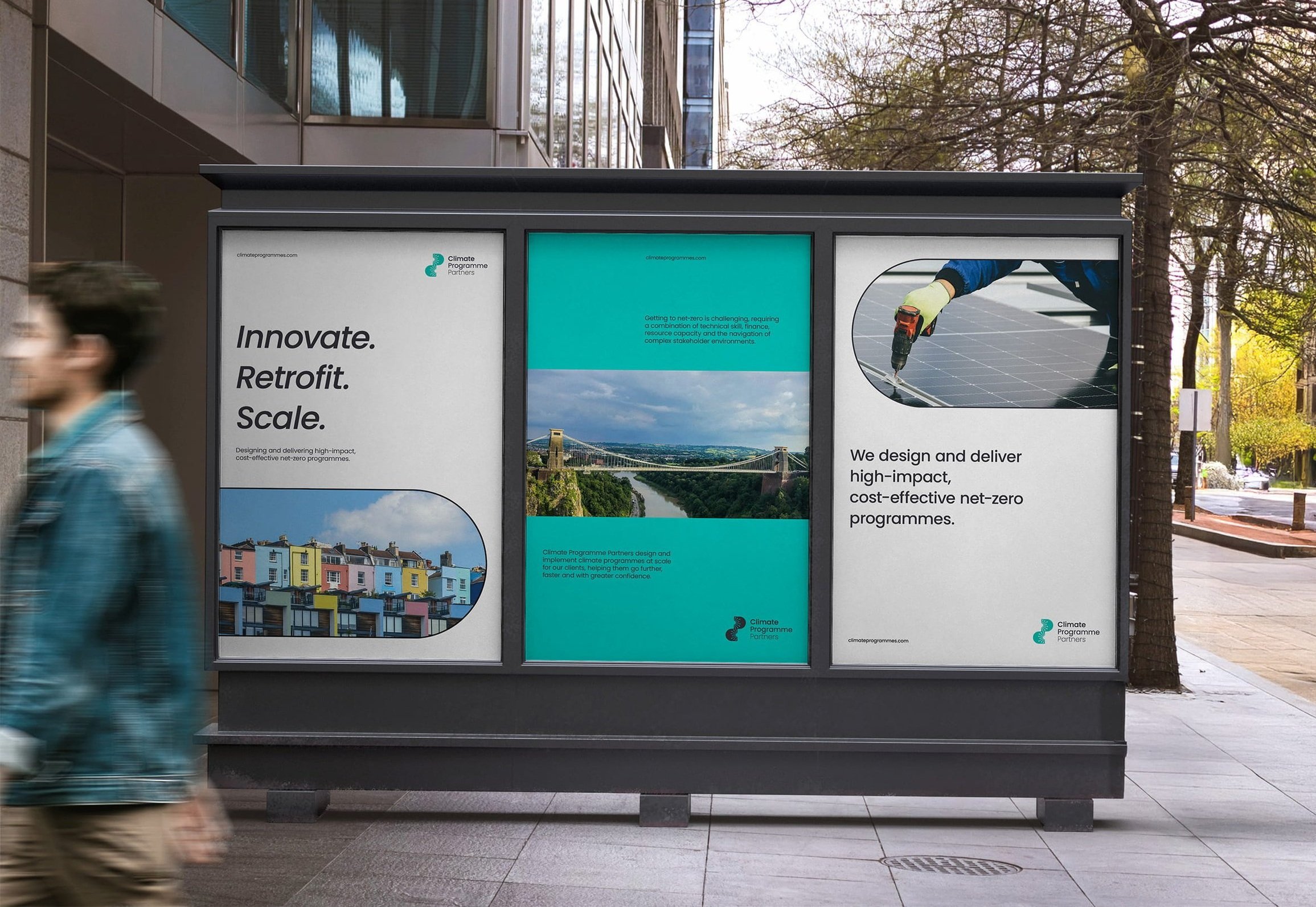
Climate Programme Partners is a strategic consultancy in Bristol that designs and delivers large-scale, high-impact climate programmes. They sought a visual identity that had a creative and inclusive feel, differentiating them from larger, more corporate consultancies.
Our Approach
The concept explores the idea of collaboration and ‘connecting the dots’ but in a unique way using the initials C and P from the name. By varying the length of the connector lines, we dial up the idea of diversity and bringing together different teams—uniting them in the centre to create a feeling of partnership and trust.
There is a balance and synergy between the two letter shapes that gives the identity a progressive yet approachable feel.
Steering away from more masculine blues, we opted for a fresh, vibrant aqua as the primary hue, complemented by a palette of warm and bright (whilst not overpowering) accent colours for a human, friendly feel. The charcoal grounds the palette, providing great contrast while maintaining a soft, contemporary feel.
For typography, we chose a clean, geometric typeface that echoed the curves and structure of the logomark.


“The end product brilliantly captures the essence and purpose I wanted to communicate."
Throughout the project, Tanya was clear and professional about the process, timings and deliverables. As someone new to branding, Tanya’s clarity and experience was super helpful, and she really took the time to understand my vision and the message I wanted to communicate.
Within about two weeks I had a professional business image, complete with colour scheme, fonts, logos and guidelines, that I can present with confidence to my clients and the wider market. I highly recommend working with her.”
Jamie Abbott, Founder of Climate Programme Partners